Adding Spatial Context Using Local or Web-based Shapefiles
April 29, 2017
There is nothing worse than being lost.
We have all experienced it. It’s the panic that overtakes you when you don’t recognize your surroundings. The buildings and roads are unfamiliar. You don’t know where you are. You have no spatial context. Naturally, you focus on getting to a familiar landmark or location. Reaching that landmark brings a sense of relief. Comfort. Peace. Because you know where you are on a map, it’s easier to plot a course to your final destination.
In the world of data science, we embrace the concept of spatial awareness and knowing where the data are (or datum is). In the same way that familiar surroundings (i. e. geo-referenced data) bring clarity to a lost traveler, spatial context can bring clarity to a data set. This “where” does not always apply to a location on the earth’s surface. Spatial context (i.e. analytic geometry), or understanding data in geometric space, is just as enlightening.
Anscombe’s Quartet - The Importance of Spatial Context
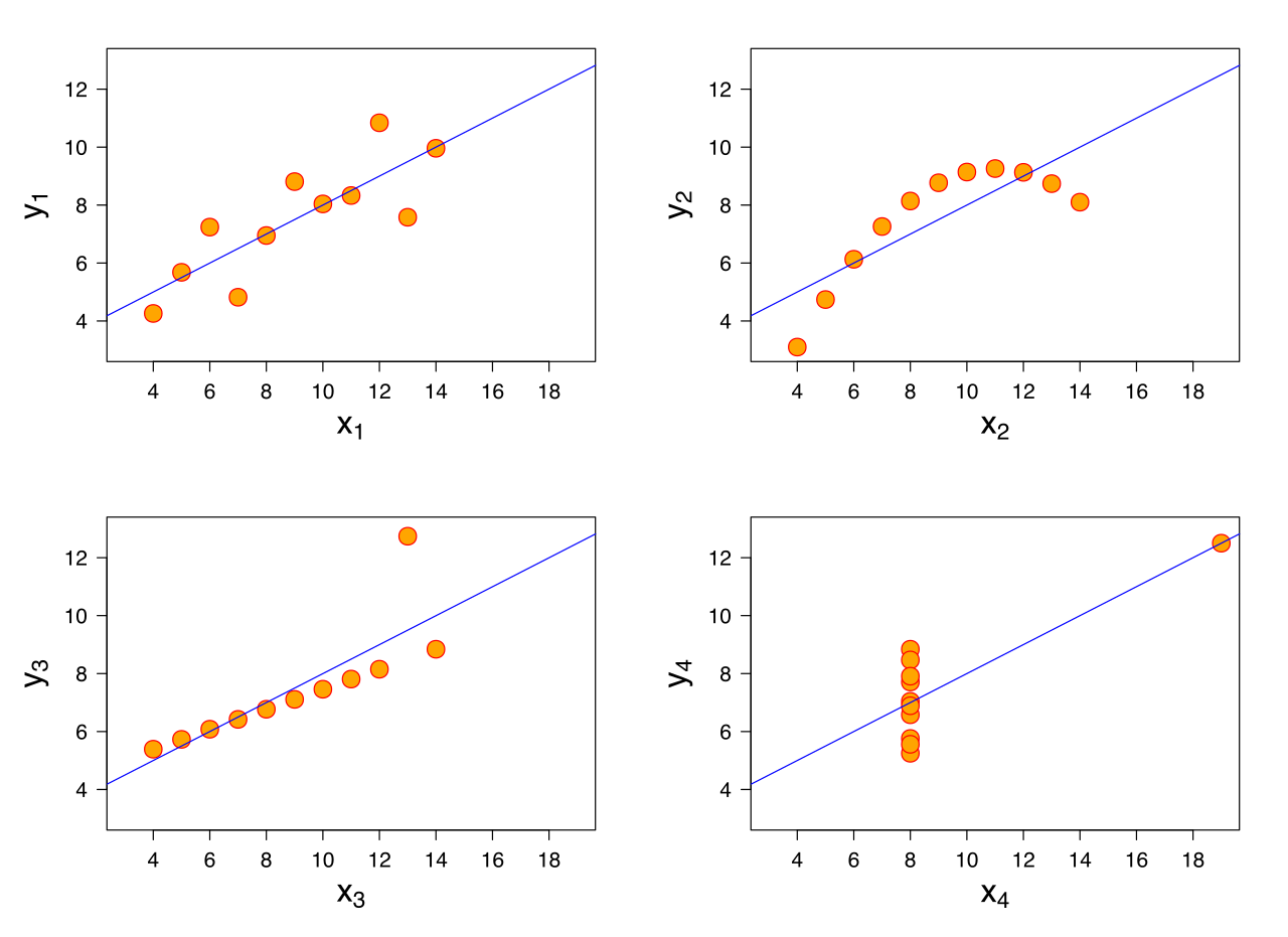
Anscombe’s quartet is a great example of non-geospatial awareness. Despite having nearly identical summary statistics, the plots are very different. This is a reminder to plot your data before drawing a conclusion. It can prevent costly errors.
Python’s seaborn library includes this data set, and we load it and compute the summary statistics. Each column is a different data set. Look at how similar the numbers are.
import seaborn as sns

# load the seaborn example data
df = sns.load_dataset('anscombe')

# group the data into multiindex df and unstack
ddf = df.groupby('dataset').describe().unstack()

# slice multiindex data
All = slice(None)
test = ddf.T.loc[(All,slice('mean','std')),All]
print(test)
| statistic | I | II | III | IV |
|---|---|---|---|---|
| Mean of X | 9.000 | 9.000 | 9.000 | 9.000 |
| StdDev of X | 3.317 | 3.317 | 3.317 | 3.317 |
| Mean of Y | 7.501 | 7.501 | 7.500 | 7.501 |
| StdDev of Y | 2.032 | 2.032 | 2.030 | 2.031 |
Very few differences right? You would expect a plot to look very similar. Let’s look at a plot of the data.

There are very few similarities! Again, this is a reminder that you should plot your data and see if you gain any new insights. Spatial context can help!
Adding Complementary Data
That small detour proved the power of spatial context and set the stage for my Github Gist. In this day and age of smartphones, geolocation services, and public data streams, geospatial data is easy to find. But getting the data is not the goal. Drawing meaning from the data is our focus. Lucky for us, the data is referenced to a spot on the earth, but we need a complementary data set with features of the earth to really add context. A dump of tweets with latitude and longitude pairs are just dots plotted on a map. But, add a basemap or underlying spatial file, and you understand where users were when they tweeted.
I made a Github Gist that helps in the “spatial file” area. All you have to do is pass a string as an argument, and regardless of whether the string points to a local or web-based file, you return a spatial object. The big benefit? This function is focused on handling zipped shapefiles! If you work with data in the geosptial arena, you are quite accustomed to zipped shapefile data.
Here is the Gist:
Demonstrating the Shapefilereader function
We will walk through a quick demo. Assume we have a geopandas data set of tweets passed to us from a colleague, and she only tells us the tweets originated in New York. She asks for our help in finding the origin zip code for each tweet. Here are the first 10 rows of the data:
import pickle
import geopandas as gpd

# load the pickled data
dg = pickle.load(open('data.pkl','rb'))
print(dg.head(10))
| lang | geometry |
|---|---|
| en | POINT (-73.985131 40.758895) |
| en | POINT (-73.86167 40.7579249) |
| en | POINT (-73.985131 40.758895) |
| en | POINT (-74.10066217000001 40.68497132) |
| en | POINT (-71.1956205 42.5047161) |
| en | POINT (-79.98186 40.4285799) |
| en | POINT (-74.018036 40.704395) |
| en | POINT (-71.1097335 42.3736158) |
| en | POINT (-72.8620251 40.8230795) |
| en | POINT (-71.4372796 41.7798226) |
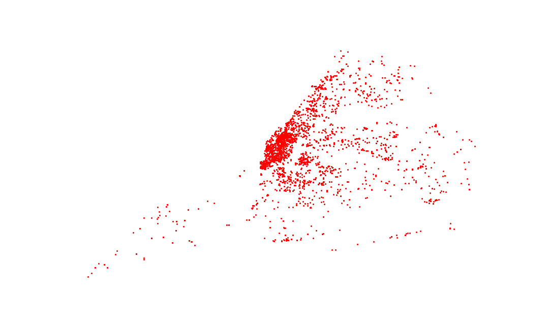
Let’s get some spatial context from the original data set. A simple scatter plot is sufficient.
import matplotlib.pyplot as plt

# plot the geodataframe
f,ax = plt.subplots(figsize=(15,9))
dg.plot(color='red',ax=ax)
plt.show()

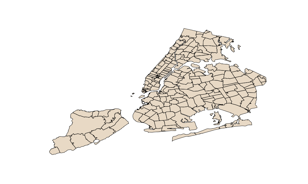
It’s hard to tell anything from this plot. An easy fix is to plot this data in the context of something known. In this case, we find a publiclly available shapefile that represents New York’s zip codes. Our new function loads the data seamlessly.
from shapefilereader import shapefilereader

# reading data from NY open data website
ny = shapefilereader('https://data.cityofnewyork.us/download/i8iw-xf4u/application%2Fzip')
ny= ny.to_crs({'init':"epsg:4326"}) # reproject coordinates

# ploting the data
f,ax = plt.subplots(figsize=(15,9))
ax.set_facecolor('lightblue') # setting ocean color
ny.plot(color='tan',ax=ax)
plt.show()

Based on the shape of the new file, we are starting to understand the context of the data. The higher concentration areas of our first plot correspond with shapes in our second plot. It’s useful, but we can do better. Let’s combine the two files using a spatial join and find the origin zip code for each tweet.
import geopandas as gpd

# geopandas spatial join on tweets and zipcode shapefile
nytweets = gpd.sjoin(dg.reset_index(),ny[['ZIPCODE','geometry']],op='intersects',how='inner')
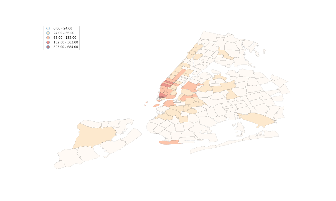
That’s more like it. We can do a lot with this new joined table, which was enabled by our shapefilereader function. Notably, we can answer our colleague’s question. Here is a graphical answer to “Which zip code had the most tweets?” using a choropleth visualization:
# group the data by zipcode
countedTweets = nytweets.groupby('ZIPCODE')['ZIPCODE']\
.size().sort_values(ascending=False)\
.reset_index().rename(columns={0:'tweetcount'})

# attribute merge with zipcode data
final = ny[['ZIPCODE','geometry']].merge(countedTweets,on='ZIPCODE')

# plot the choropleth
f,ax = plt.subplots(figsize=(15,9))
final.plot(column='tweetcount', scheme='Fisher_Jenks', k=5, cmap='OrRd', linewidth=0.1, ax=ax,legend=True)
ax.set_axis_off()
plt.show()

And here are the first 10 rows of our tabular answer to the same question.
| ZIPCODE | tweet count |
|---|---|
| 10007 | 684 |
| 10036 | 303 |
| 10001 | 257 |
| 10013 | 199 |
| 83 | 132 |
| 10003 | 131 |
| 10019 | 130 |
| 11201 | 122 |
| 10014 | 120 |
| 10011 | 99 |
Conclusion
As shown above, spatial clarity can improve your understanding of data. Feel free to use the shapefilereader function to add complementary data sets to your geospatial analysis tasks. We combined our source data with a publicly available shapefile. And in the end, we were able to answer our target questions in visual and tabular format. Try a similar workflow on one of your datasets!